How many times have you signed up to a newsletter only to be inundated with rubbish mail-out more than once a week? The images don’t fit, there are more than the odd one or two typos and no effort in the content… You’d unsubscribe – if the button was working, that is. It is a nightmare to have an email inbox heaving with tat. So, when you produce your newsletter – go for gold.
“Focus on growing your list all of the time as newer subscribers are more engaged adding to healthier open rates and ROI.”
Karl Murray
Here are a few tips to get you on the path the newsletter notoriety.

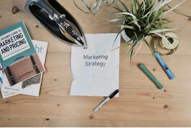
Photo by Campaign Creators on Unsplash
Mobile
Every single thing you create should have the correct width and accessibility on mobiles and tablets. More people own smartphones than desktops, so skipping out on user experience for mobile users is a mistake. Think single column designs and larger fonts.
Clean
Keep everything clean and simple. Avoid things that are too flash, or that add nothing to the newsletter. They take up space and ultimately will slow down your newsletter. Before you build anything, sit down and take a moment to sketch it out. Think about clean lines, the colors you might use, and white space is your friend.
Don’t Babble
There is nothing worse than a newsletter that goes on and on and… you get the idea. Attention spans are short, so you have a matter of seconds to grab your reader. You have to think carefully about the topics you want to deliver, and how many, is too many?
You aren’t the only newsletter out there, so you need to give people a reason to open your email. An email subject line emoji is a smart way to grab attention before your newsletter has even been opened.
Guide Them
Whatever you put at the top needs to be what you want them to see first – obviously. Or is it? Using different sizes, contrasts and shapes you can carefully guide your reader further into your email. With the right copy, you can get them to scroll, and suddenly they’re at the end of your email right next to your call to action.
Prime Space
Headers and footers are perfect for framing critical information. The header, spanning up to three inches in some cases, can be a great space to make an impression. The footer can provide an excellent place for your social media links. However, you should also remember to have a distinct area for people to unsubscribe from your newsletter ,too.
Color Clever
There is a lot of research on how colors can influence emotions and intentions. Be intentional with your color choices. For example black, gold and purples all give an air of luxury and sophistication. Blue and green evoke calmness and relaxation. So be sure to do some research into what colors will benefit your newsletter the most.


